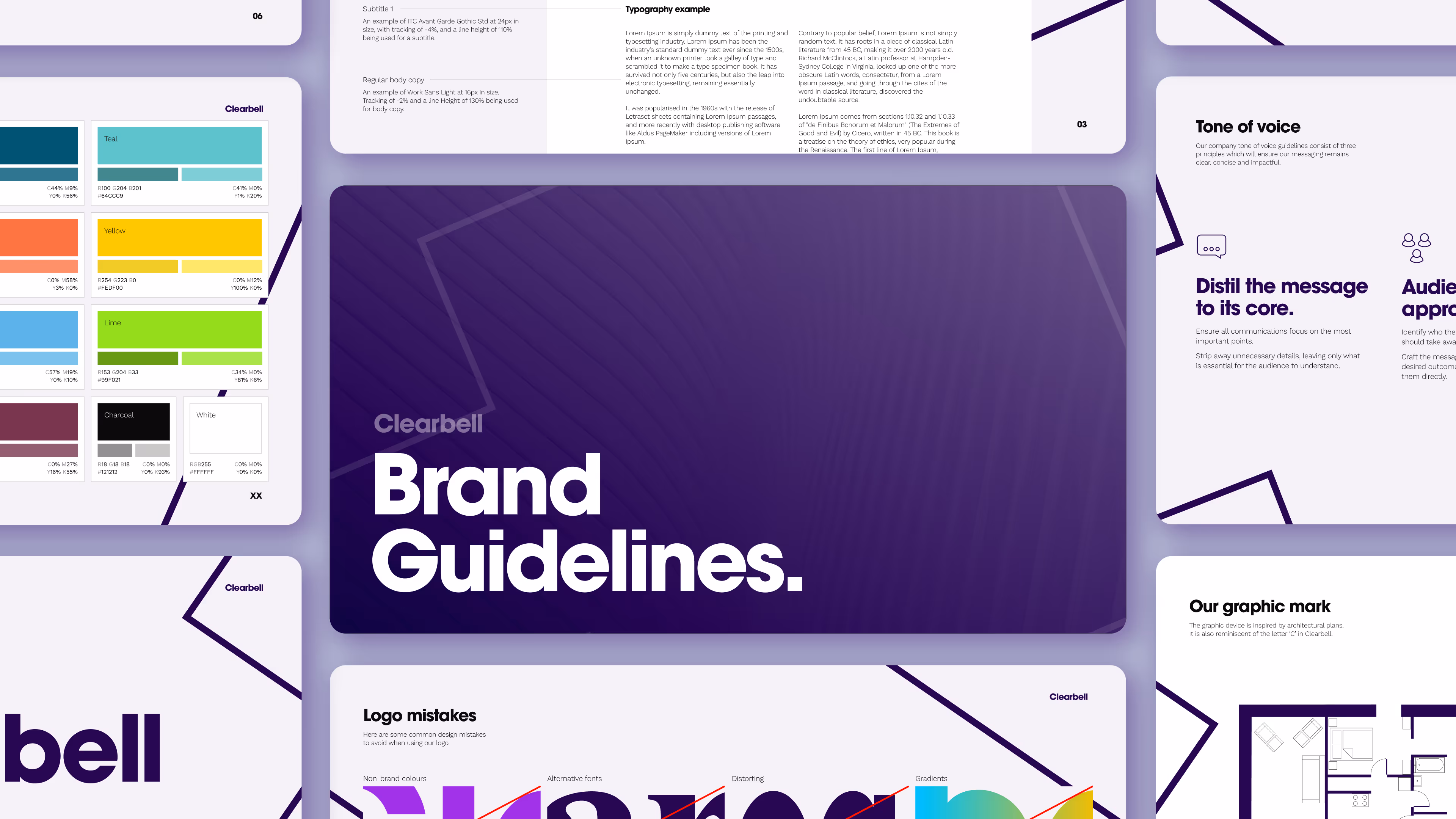
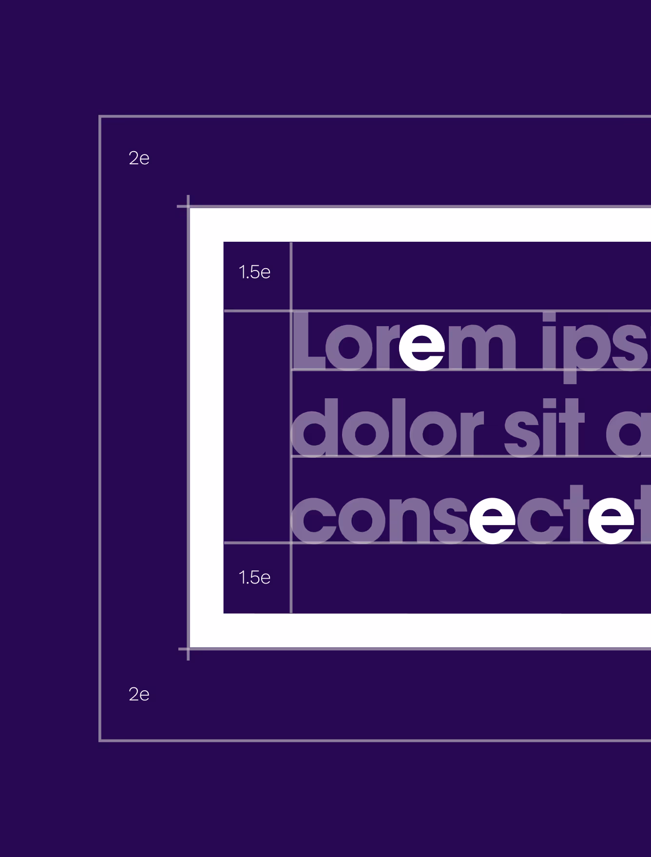
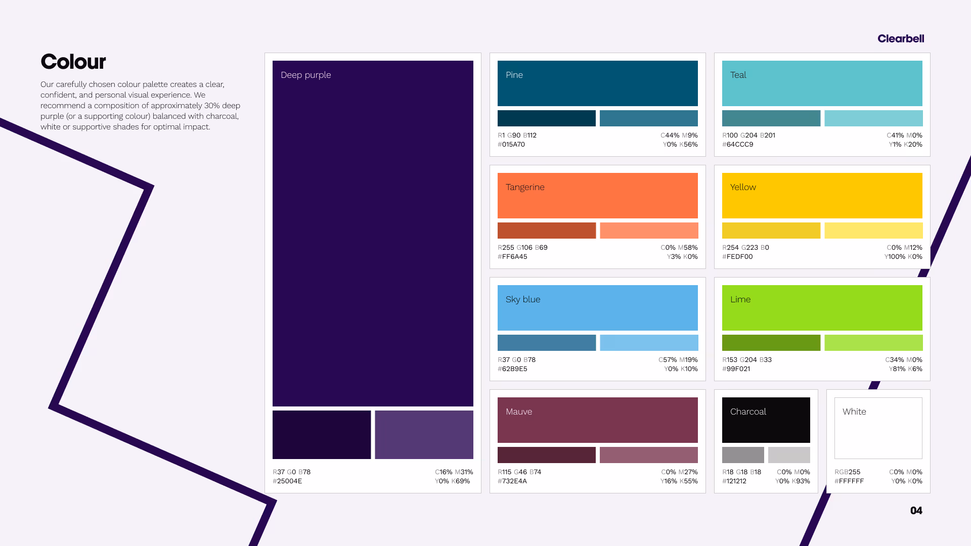
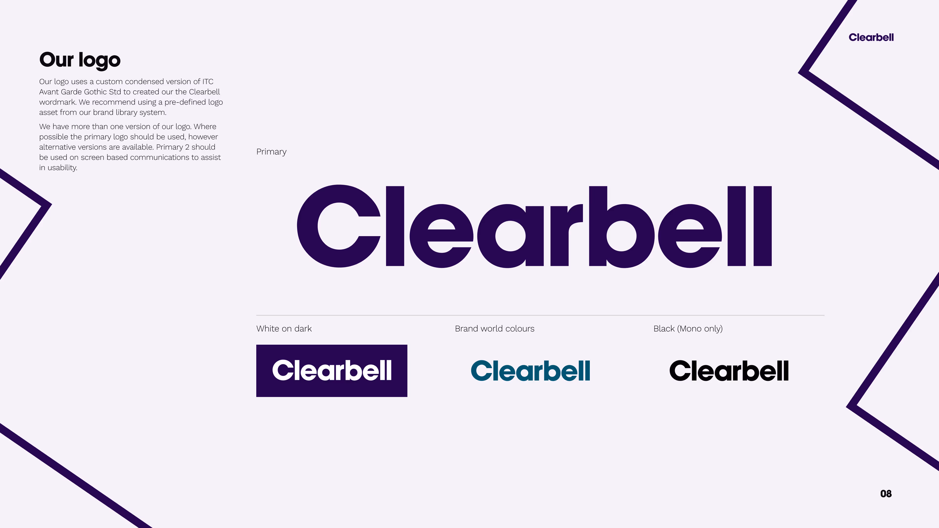
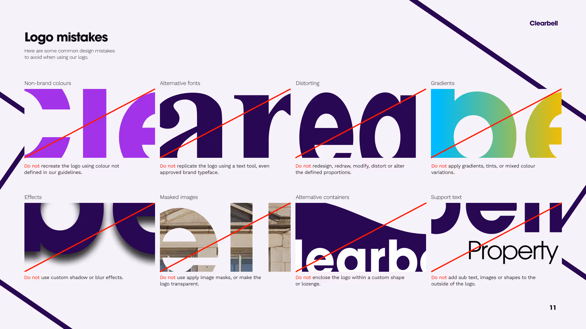
Clearbell Brand Guideliens

Refining how new employees and partners use the brand across digital and print marketing material.

Clearbell, a real estate fund management and advisory firm, had outdated 60+ page brand guidelines that failed to ensure consistency across digital and print materials. I redesigned the guidelines, creating a streamlined primary document and a concise cheat sheet, making the brand easier to understand and apply. This showcase page highlights my approach.

Research

Visual Design

Photoshop

Figma

Clearbell old graphic markClearbell new graphic mark
Before
After
Spacing rules for Clearbell graphic markAn illustration of a floorplanSpacing rules of clearbell logo
I redesigned Clearbell’s graphic mark, used as a stamp across digital and printed marketing materials. To ensure consistency, I established spacing rules based on the size of the letter “e” within the mark and increased the stroke weight to give it greater presence. I also introduced clear usage guidelines, restricting applications to either three lines of text alongside the logo or three lines matching the logo’s size. These rules were documented in both a concise cheat sheet and the refined brand guideline.
"Lawrence took on the challenge of reviving Clearbell’s brand guidelines and did an excellent job from start to finish. He brought clarity and structure, refining the typography, colour palette, and usage rules into a coherent identity. The handover was exceptionally professional with every detail documented."
Profile picture of Jonathan Burrows
Jonathan Burrows
Freelance Senior UI Designer
Next Case Study
Range Rover Future Digital Experience